Noise.
From hyperventilating news reporters to the incessant honking on the roads, from the pings and the dings of mobile phones on dinner tables to 'thak thak' of construction work, it’s a noisy world we live in. Add to this the chaotic world of advertisements, those annoying little bits which interrupt the flow of your movie or song, and make you reach out for the remote.
“What is life if full of care,
You have no time to stand and stare”
Stand and stare, hahaha! One hardly ever gives a second glance to the run-of-the-mill stuff churned out of the Generic Ads Assembly Line. But in this cacophony of mediocrity, there come these pieces of genius which stand out and amaze you by the sophistication of their sheer simplicity.
Minimalistic ad campaigns are a breath of fresh air in the clutter of ads a consumer is inundated with every waking moment. These ads are making companies take a relook at the often neglected but ubiquitous media platform: the print. They have less, almost nil visual and textual clutter and involve the reader’s grey cells, thus creating a long lasting recall value. They draw the viewer’s attention towards one very strong, central theme, use the space to convey the message, and usually evoke an emotion- humour, fear, shock. Brilliant minimalist ads are grabbing hashtags and retweets, and herald ‘achche din’ for the smart,discerning audience.
Here is a look at the most creative, most eyeball-grabbing, most viral minimalist ads of recent times, which convey so much in so less:
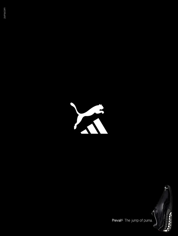
1. This Puma ad cleverly shows the brand's superiority over a famous rival.
2. This MTV ad commemorates MJ using his famous moonwalk step as a black ribbon to convey a message.

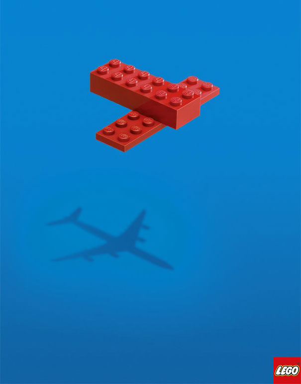
3. These Lego ads convey the power of imagination.

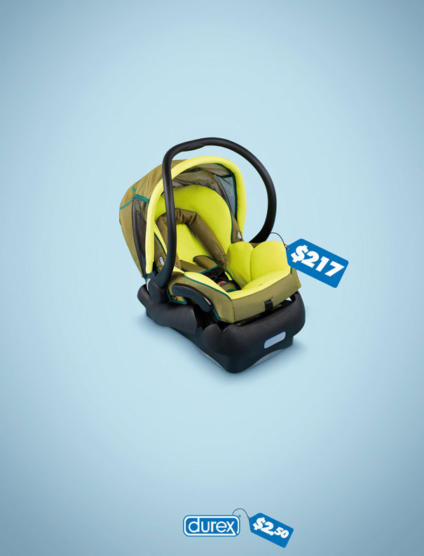
4. Durex is well known for its witty, minimalist ads. The following print conveys a strong message and says a lot without saying anything.
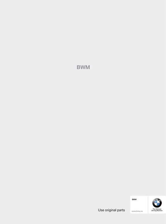
5. BMW cleverly uses the typo to drive home its point.
6. FedEx brilliantly integrates its colours into what they call The Statue of Sugarloaf. It subtly tells the reader about FedEx's NY-Rio service.

7. The following KitKat ad sums up what the brand stands for.

8. McDonald's announced its free wifi to the world by the following brilliantly done print:

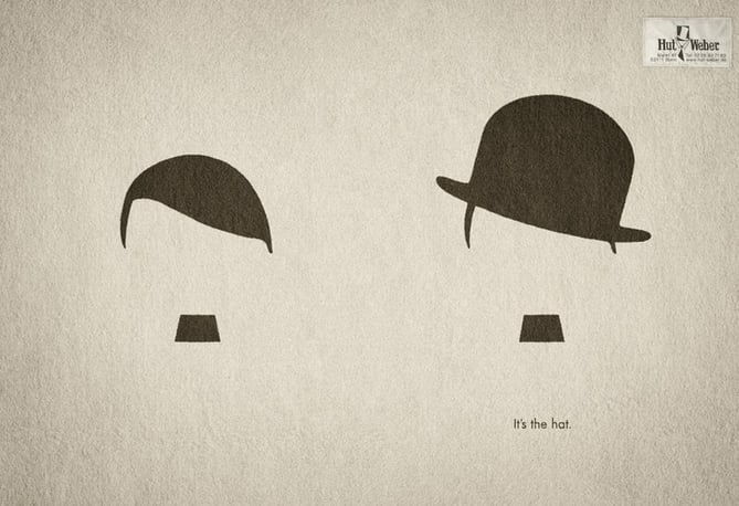
9. This hat manufacturer cleverly tells the reader what a difference a hat can make
10. Coca Cola and lemon light. 'Nuff said.
