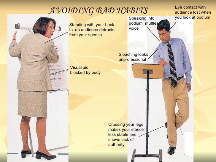
For any successful business professional, public speaking and presenting have become more important now, than ever before. Whether you are making a pitch to your management or sharing your value proposition with your client, presentations can often, make or break your proposition.
While many us make presentations on a regular basis, few of us really make it systematically to ensure successful outcomes. So, how do you ensure your presentations are superb? How do you ensure that you woo your audience and don’t make mistakes that put them off.
Here are ten pointers, on flaws that could potentially derail your presentation.
1. Negative Body Language
The Chinese have a saying- ‘A man without a smiling face, should not open a shop.’ This holds good for any presentation as well.
If your body language screams discomfort and nervousness, you would have alienated half your audience without even saying a word! If you are standing with your arms crossed or have a grim expression on your face, it doesn't say much about your confidence.
 I was once speaking at the convocation ceremony of a Business School.
 All the other speakers before me came armed with power point presentations. I seemed to be the only one without a deck and began to get a little jittery, that I had made a mistake.
The speaker immediately before me was a 55 year old corporate executive who I knew, would have made countless presentations. He went on the podium, opened his power point deck and then shuffled a bunch of papers in his hand, that were probably speaker notes.
I couldn’t help noticing that his hands were shivering and he could barely hold the sheaf of papers straight. He was experiencing so much discomfort that the audience was totally disconnected while he was speaking. Seeing the extent of his nervousness was an eye opener.
I realized that it was futile to doubt your capabilities and bolstered by that thought went ahead and delivered a message that the audience appreciated.
Before you step on the podium, breathe deeply and compose yourself. Remember it is not strange for even seasoned presenters to feel nervous and uncomfortable before a presentation. You are not alone. The only difference is that good speakers channelize their nervousness to make them perform even better.
So, watch out for your body language! Remember 80% 0f all communication, is non verbal.
2. Speaking Fast, Slow or Inaudibly
Imagine if you were asked to read the number plates, of cars in the picture above? How frustrated would you get, trying to do it? Sometimes presentations turn out to be an equally futile exercise when you don't understand most of what the presenter said.
A presentation is about communicating and connecting with your audience. Even if you have the best of slides, if you speak rapidly without pausing or speak too slowly or speak without any emotion, you are not going to establish any connect with your audience. So how will you achieve your objective?
As a part of our proposal evaluation,
I was once presenting our value proposition to a potential client. The company that had been invited to present before us had come armed with endless slides on literally every aspect of their proposal. In a bid to cover as many slides as possible within their allotted time, their presenter had gone over each slide very rapidly.
The moment I entered the room, the first thing we were told was- “Keep your presentation brief.” Realizing that the earlier presentation seemed to have antagonized the client in some way, I decided to skip the slides altogether and show them a demo of a portal which was a part of our presentation. The demo was a success and there was very little that I had to say before there was a flurry of questions from the client.
We won the project.
Here is a link to an interesting video clip on what brings presentation quality down!
3. Looking At The Slides Instead Of The Audience While Talking
Have you ever felt comfortable talking to someone who just refused to look at you while you talked to him or her? Probably not!
A presentation is no different.
If you look at the slides that you have displayed and continue to speak, how will anyone in the audience ever relate to what you are saying? The most powerful of messages, could go waste.
Maintaining eye contact with your audience not only allows you to connect with them, it also allows you to personalize your message based on the audience reactions that you observe.
But, maintaining eye contact does not mean you continue to look at the friendly face you see in the audience.
A great presentation is like a one-on-one conversation where each participant feels that the speaker is directly talking to him. And, the only way this can happen is with continuous eye contact.
4. Presenting Cluttered Slides And/Or Too Many Slides
Many of you would have been in presentations where a speaker displayed slides with so much information on them that it was practically impossible to read what was on the slide. Were any of you impressed with such slides? In all probability, the answer would be ‘No’.
Slides are meant to organize your messages and provide support. They are not meant to substitute, all that you intend to say.
Interestingly, the human brain processes visuals 50 times faster than text. This is a good thing to leverage in presentations.
I once attended a presentation on prison security systems delivered by a prison administrator in India. The presentation was truly amazing. Each slide had a picture and just a one line message that he amplified. The result was startling. The entire audience sat spellbound listening to this man deliver an intricate presentation with such simplicity!
5. Lack Of Preparation
Many of us are professionals and have cleared professional examinations in our lives.
Would any of us think of appearing for a professional exam with little or no preparation?
Consider another scenario,
how many of us would appear for a job interview with a company that we very much want to work, with inadequate preparation?
Then, how can you treat a presentation differently?
Preparation is the key to any presentation. On an average, a one-hour presentation should call for at-least 20 hours of preparation. The point is- at the very least you need to know the subject, the audience you will be addressing, the content of your presentation and what key messages you want to leave behind. In addition, you also need to practice your presentation delivery.
Steve Jobs was among the most consummate presenters who repeatedly wowed audiences with his presentation skills.
Here is a link to a short video titled – ‘Make a Presentation Like Steve Jobs’.Make A Presentation Like Steve Jobs
6. Not Focusing Adequately on Your Presentation Design
You need to have the presentation objective, the theme, a construct of the presentation and key messages to create the slides.
Having multiple fonts, poor quality visuals, overcrowded charts and text can be detrimental to your presentation.
Besides, having a multitude of effects can also take the audience’s attention away from the presentation itself.
Interestingly, Guy Kawasaki suggests that slideshows should contain no more than 10 slides, last no more than 20 minutes and use a font size of no less than 30 point.
7. Not Engaging Your Audience Adequately
A presentation is not meant to be a one-way lecture. Assuming that there is some objective behind your presentation, it is important that you are able to engage the audience. Getting them to ask questions, bringing in examples relevant to the audience, asking them questions, are all a part of engaging the audience.
8. Underestimating The Power Of A Story Or Emotionally Engaging Experience
Even the most complex of technical presentations can be woven into a story. When you bring in interesting stories that embellish the message you are conveying, it has far more impact then just giving out facts and figures.
Good presentations include stories. The best presenters illustrate their points with the use of stories, most often personal ones. The easiest way to explain complicated ideas is through examples or by sharing a story that underscores the point.
Here is an example from the world of advertising
Dove Case Study
Dove's marketing director Stacie Bright had a moral problem in 2006.
After years of marketing Dove’s products using what the mainstream considers ‘beautiful’ models Bright realised this was affecting her own daughter’s self-esteem, and therefore affecting the self-esteem of everybody's daughter subjected to this advertising.
Bright created a mock-up advert using all of the company directors' own daughters with text alongside each image saying how these girls believed they weren’t beautiful.
Bright and her team showed it to the executives, confident that this was a risky but worthwhile move.
The risk worked. Dove executives were of course deeply affected, said a resounding yes through their tears, and completely overhauled Dove’s marketing strategy, which has continued to this day.
The campaign underscored the power of using stories to make a culturally positive difference.
Stories work everywhere and can provide an emotional foundation to your content.
9. Not Knowing Your Audience Beforehand
When you are asked to present you need to know beforehand who is the audience, what is the theme of the event, what are the expectations from your presentation and details of the venue, date and time.
To connect with your audience, you need to understand why your topic is important to them. What do they expect to learn from the presentation? It is also important to know the level of knowledge they have on your topic, so you can present the information with the correct tone to keep people interested and engaged.
A perfect example of how 'Not' to know your audience is to speak in acronyms and technical jargon that your audience does not know or care about.
10. Leaving No Takeaways
A presentation should generate some outcome. The outcome could be a call to action or a message that forces the audience to think even after the presentation is long over. Either way, if you deliver a presentation where the audience does not feel it has learnt anything or needs to do something differently, or feel enriched, you are better off not making the presentation in the first place.
------
Image courtesy-Flickr ; Video courtesy- Ethan Rotman, BNET.com; Case study courtesy- Christopher Ratcliff
About the Author
Srinivasan is an independent consultant working in the area of strategy and technology interventions in the public sector domain. He has worked in companies like IBM and TCS and has over 30 years of experience across 24 countries.


