As a marketing manager, you may have to make critical decisions on the launch of your new product based on the data provided by your market research department.
As a finance manager, you need to analyze the financial data of your company and make critical decisions pertaining to some important factors.
As an HR manager, you need to go through records of your employees in order to take decisions regarding appraisals and evaluation.
Hence managers need the aptitude to process large amount of data and draw quick conclusions out of it.
This, perhaps, is the reason CAT has a section dedicated to data interpretation
Data can be represented in the form of tables, graphs or even caselets. Data represented in the form of a table is raw and usually is quite time consuming to process such data. Analyses such as trends, problem areas, percentage distribution are quite difficult to perform when the data is represented in the form of a table. Graphs on the other hand represent the same data visually. Graphs offer the luxury of processing data by observation as we can easily see the trends and distribution. Even problem areas are easy to identify by looking at the deviation from the trends. Representing data in the form of caselets is quite uncommon in the real world. However, it is very popular with car examiners. In this case, date is hidden between paragraphs and you have to unearth the data as you go on reading the paragraph. This is probably the worst case of data representation when it comes to analyzing and drawing conclusions out of it.
How is Data Interpretation in CAT different?
At first glance at a set, no one can grasp what the set is pertaining to. It is as you go on reading and solving and unearthing information bit by bit, the set reveals itself as a whole. The sets are logical, based on reasoning. Before one attempts to solve the question, he will have to think over it for 5-7 mins. The questions in such sets are NEVER direct. Most of such sets have to be left directly on the face of it.
The trend has shifted from easy-to-understand-data-with-difficult-calculations to more logical questions with lesser calculations. Though the trend has moved away from long and complicated calculations, it's not advisable to attempt CAT without being reasonably good at quick calculations and approximations.
In recent years, some of the questions in this section have become tougher. What must be remembered is that, like other sections as well, if you make sure that you are familiar with the type of questions that you get and the possible methods of solution, you should be able to manage a decent score.
The Online Angle!
What are the challenges you could face in DI by virtue of CAT going Online?
- A possibility of drop in the difficulty level of DI sets, sort of modeling itself on the GRE.
- Interpreting data would be tougher online especially since you cannot use a pencil or any other guidelines to help you figure out exact values.
- Because of limited scope of screen size, big tables heavy on data may go missing.
Types of Data Representation
Tables
Tables refer to the arrangement of data in the form of rows and columns.
Positives:
- Data is available in compiled form, hence there is no ambiguity in interpretation.
- Data Values are directly given and hence one need not spend time finding the accurate Values.
Negatives:
- Trends cannot be easily established in the table.
- One can get confused over the sheer volume of the data.
Cheat Code to crack DI sets containing Tables?
Do not get carried away by the sheer amount of data, the set may be easy for all you know!
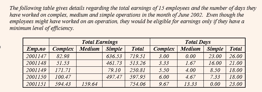
Check out this table from CAT 2002.
At the first glance, it seems that this table has too data intensive and hence should not be attempted. But on second thoughts if you look at the questions, you will find that this is a simple set pertaining to counting some values. So rather than getting carried away by the volume of data, you need to have a look at the questions as well.
Modify the question such that the answers can be easily calculated
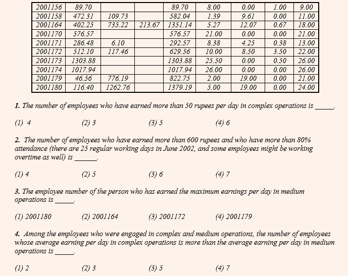
Check out this table pertaining to CAT 2005
In the first question, we need to find the ratio of ‘production to population’ i.e. divide the second-last column with the last one and find out how many of these values are greater than that of Gujarat. However one may find that this division results in values in fractions and hence difficult to compute. Instead, if we were to modify the question and calculate the ratio of ‘population to production’ and find out how many of these values are less than that of Gujarat, the entire calculation becomes oral. For example, for Gujarat this value is between 2 and 3. We can find that the only states for which this value is less than that of Gujarat are Haryana (1…), Punjab (1), Maharashtra (2…) and Andhra Pradesh (0…).
Similarly in the second question, we need to simply figure out that the values of the second last column need to be multiplied by 10 and this needs to be divided by the values of the last column. The states where this value is more than 4 is Haryana, Gujarat, Punjab, Madhya Pradesh, Tamil Nadu, Maharashtra, Uttar Pradesh and Andhra Pradesh.
Graphs
While tables express actual numbers, graphs are a diagrammatic representation of data. They bring out the relationship between data more clearly than numbers in a table. For example, a pie-chart can bring out clearly the percentage that Anil Ambani owns of Reliance Communications Ltd and the fact that he is the largest shareholder, while a table would require you to actually calculate the percentage of each shareholder's ownership to find out the largest shareholder. Graphs are far better to understand changes in variables - whether a particular value has risen or fallen over the past few years and hence analyze the trends.
Pie Charts
They
derive their name from its shape, like that of a pie divided into various portions. They always represent data in the form of a percentage of the total, with the total percentage being 100. In such a chart, the length of the arc (and therefore the angle each sector subtends at the centre) is proportional to the quantity it represents. Such charts are often used in the corporate world and in newspapers. Since a circle comprises 360 degrees, each percent of a pie-chart is equal to 360 divided by 100, or 3.6 degrees. This fact will be important for the calculations you are expected to perform.
Positives:
- More effective in calculating the percentage share of each element in the total.
- Questions based on comparisons can be effectively solved using pie charts.
- One pie chart can represent only one data set. Hence, when a question pertaining to pie chart is asked, in most cases data pertaining to only one or two data sets are asked. Because of this a student need to handle only limited number of data values.
Negatives:
- Less accurate than tables as one may take time to establish values.
- Trends cannot be established in a pie-chart.
Cheat Code to crack DI sets containing Pie Charts?
1. Ignore the overall value in comparison based questions and avoid calculating every value.
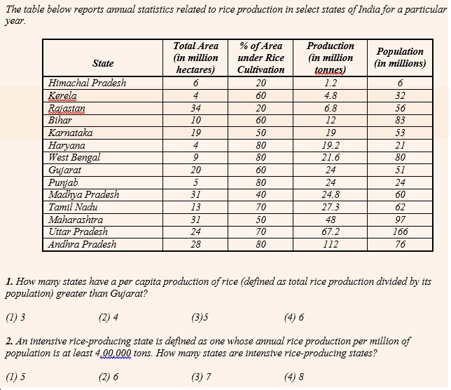
Here is a CAT 2002 set to illustrate the same.
In the above question, a normal tendency would be to calculate the value and quantity for all 6 suppliers and find out for which country is this ratio the highest. However you need not do this! Since the overall values of both the pie-charts are same for all the countries, we need to simply compare the ratio of the respective percentages of the two pie-charts. This ratio is close to 2 for Switzerland (20 / 11). No other country is even close to this.
2. Replace big values by small values for comparison sake.
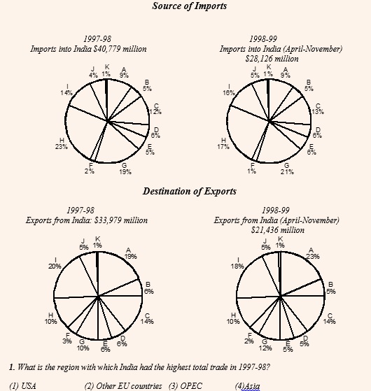
Consider this CAT 1999 set for example
Consider the information provided in the figure below relating to India’s foreign trade in 1997-98 and the first eight months of 1998-99. Total trade with a region is defined as the sum of exports to and imports from that region. Trade deficit is defined as the excess of imports over exports. Trade deficit may be negative.
A. U.S.A.
B. Germany
C. Other E.U. countries
D. U.K.
E. Japan
F. Russia
G. Other East European countries
H. OPEC
I. Asia
J. Other L.D.C.s
K. Others
In the first question above, though we can shortlist OPEC (H) and Asia (I) by the sheer value of the percentages, it would take a little while to shortlist between the two. What you could have done is instead of taking the values as $40,779 and $33,979, we could have approximated it as 41 : 34 or approximately 6 : 5. Now, with these values, we can compare H and I easily. For example, in case of H, the total trade would be (23 × 6) + (10 × 5) = 188 and in case of I it would be (14 × 6) + (20 × 5) = 184. Clearly the value is higher for H i.e. OPEC.
3. Deploy smart techniques to do percentage calculations.
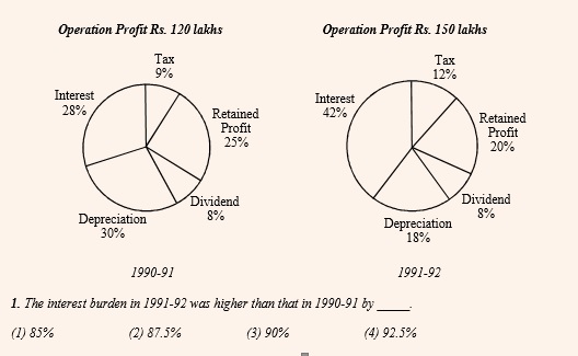
Check out this CAT 1995 question.
The above question can be solved in two ways:
Traditional Method: Interest in 1990-91 = 28% of 120 = 33.6, Interest in 1991-92 = 42% of 150 = 63. Hence Percentage increase = 29.4 / 33.6 = 87.5%. Obviously, this would involve some bit of caluculation.
CPLC Method: Overall Operating Profit has increase by 25% i.e. from 120 to 150 (this can be done mentally). The percentage share of interest has increased by 50% i.e. from 28 to 42 (this can be done mentally). Hence, the overall Percentage increase in interest value will be successive percentage of these two values i.e. 25 + 50 + 12.5 = 87.5% (this can be done mentally as well.
What is also means is that if we were required to find that component which has undergone the highest / lowest percentage change over the two years, you can simply find out that component that has undergone the highest / lowest percentage change in its market shares and get the answer. You need not bring the overall values (120 and 150) into the picture at all!
(Get Recorded lectures from CPLC faculty
here)
Bar Graphs
Bar graphs represent data in the form of columns or bars. Bar graphs can be horizontal or vertical. The length of the bar is proportional to the data value represented by it.
Positives:
- Trends can be easily established as compared to tables and pie-charts.
- Comparative type questions can be easily solved by visual inspection of graph.
Negatives:
- Less accurate than tables as at times, especially when the grid lines of the graph are missing because of which exact value of the bar cannot be accurately established.
- The graph may get a little complicated in case of multiple bar chart or stacked bar chart.
Cheat Code to crack DI sets containing Bar Graphs?
1. In comparison based questions use the lengths of the bar and not exact values to solve the questions visually.
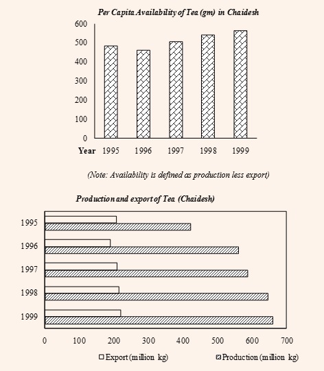
Here is a CAT 2003 (Feb) DI set to illustrate the same.
- In which year during the given period was Chaidesh’s export of tea, as a proportion of tea produced, the highest?
(1) 1995 (2)1996 (3) 1997 (4) 1998
It is clear that to solve the above question we need to look at the second graph. However, rather than struggling to get the exact values and then spending more time diving them to get the answer, we can do better by solving the question visually. The question boils down to diving the un-shaded bars by the shaded ones and find out for which year would this value be the highest. For a fraction to be the highest, its numerator should be as high as possible and the denominator should be as low as possible. In other words, the un-shaded bar should be as long as possible and the shaded bar should be as short as possible. This is clearly seen for the year 1995.
Use the gridlines effectively for quick calculations
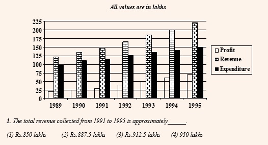
Let us solve this CAT 1996 question to understand the same
One way to solve the above question is to add up the exact values and get the answer. The other way is to establish every value of the Revenue in terms of ‘Gridlines’. For example, in 1991, the value of Revenue corresponds to 5.75 gridlines. Similarly for 1992 it is 6.5, for 1993 it is 7.5, for 1994 it is 8 and for 1995 it is 8.75. If we were to add all, we get a value equivalent to 36.5 gridlines. Since we know every gridline corresponds to a value of 25 lakhs, every 4 gridlines would correspond to a value of 100 lakhs or 36 gridlines would correspond to a value of 900 lakhs. Plus another 0.5 grid lines corresponds to 12.5 lakhs. Thus the total revenue for the given 5 years is 912.5 lakhs.
This method helps you to deal with single-digit or two-digit values and hence enhance your calculation speed.
Line Graphs
Line graph represents data in the form of straight lines that connect various data values. Both line graphs and bar graphs are used to convey same things and hence can be used inter-changeably. For example, a line graph can be generated by joining the tip of the bar graph.
Positives:
- Trends can be even better established in Line graphs than Bar graphs.
- Questions pertaining to percentage change and growth rates become easier to solve using line graphs.
Negatives:
- It has a similar disadvantage as the Bar graph in terms of establishing the exact values.
- Line graphs can only indicate the value at the end of a certain period and not between any two values.
(Get Recorded lectures from CPLC faculty
here)
Cheat Code to crack DI sets containing Line Graphs?
- Use the advantage of looking at slope of the line in questions pertaining to growth rates.
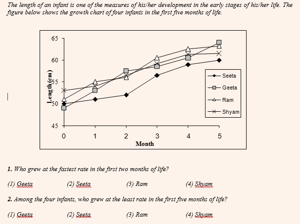
Let us have a look at this CAT 2003 (Nov) example to drive home the point
The growth rate or the decline rate is calculated as the growth or the decline as a percentage of the initial value. For this rate to be highest, the growth or the decline has to be the highest on a very small initial value. While for this rate to be the lowest, the growth or the decline has to be the lowest on a very high initial value.
For the first question, we need to compare the values pertaining to the ‘0
th month’ and the ‘2
nd month’. Now looking at the slope (steepness) of the graph, it is clear that the answer is Geeta. For her the growth is the highest and that has happened on a very small initial value.
For the second question, we need to compare values pertaining to the ‘0
th month’ and the ‘5
th month’. Again, it is very clear that the answer is Shyam. The growth is the least in his case and that too on a very high initial value.
Beware that in a Line graph you can only know value at the end of a certain time period and not the values in between two time periods.
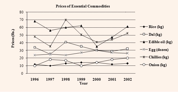
Here is a CAT 2003 (Feb) set to understand this.
In the above graph, how many times during the given time period do you think was the price of Rice and Onion the same?
From the graph, it seems like 3, because the two graphs intersect thrice – once between 96 and 97, once between 98 and 99 and once at 2000. However, we can only be sure about the year 2000. What is important to know is that the line graph can only show the values at the end of a particular time period (in this case ‘year’). We can never comment what happened in between two years. For example, at the end of 1996, the price of Rice was Rs.12/kg and at the end of 1997 it was Rs.10/kg. Similarly, the price of Onion was Rs.10/kg and Rs.18/kg between these two time periods. We had to join these two points by a straight line, and they intersect at a point (in this case at Rs.11/kg). This is no way indicates that the prices of these two commodities had been Rs.11/kg between 1996 and 1997.
Caselets
In caselets, the mathematical data is represented in the form of a paragraph. Hence extracting data and establishing relationships between different data values becomes difficult. However caselets are very popular with that CAT examiners.
Positives:
- Most caselets seem difficult due to lack of data values, but are very easy when you get down to solving them.
Negatives:
- Data values are not easily available and hence you need to have a lot of patience to decipher a lot of it after reading the passage.
Cheat Code to crack DI sets containing Caselets?
Represent the data in a form such that you can easily extract the data for the questions that follow
Let us look at this CAT 2005 set to understand this.
Help Distress (HD) is and NGO involved in providing assistance to people suffering from natural disasters. Currently, it has 37 volunteers. They are involved in three projects: Tsunami Relief (TR) in Tamil Nadu, Flood Relief (FR) in Maharashtra and Earthquake Relief (ER) in Gujarat. Each volunteer working with Help Distress has to be involved in at least one relief work project.
- A maximum number of volunteers are involved in the FR project. Among them, the number
of volunteers involved in the FR project alone is equal to the volunteers having additional
involvement in the ER project.
- The number of volunteers involved in the ER project alone is double the number of
volunteers involved in all the three projects.
- 17 volunteers are involved in the TR project.
- The number of volunteers involved in the TR project alone is one less than the number of
volunteers involved in the ER project alone.
- Ten volunteers involved in the TR project are also involved in at least one more project.
The above set can be represented in the form of a Venn Diagram having three sets TR, FR and ER. Similarly, you can represent data in the form of a Table or a Network. The idea is to help us get the required data with a single glance upon reading the question.
(Get Recorded lectures from CPLC faculty
here)
Always start a caselet with a value that you can directly plug in.
Have a look at this CAT 1991 caselet:
Ghosh Babu deposited a certain sum of money in a bank in 1986. The bank calculated interest on the principal at 10 percent simple interest, and credited it to the account once a year. After the 1st year, Ghosh Babu withdrew the entire interest and 20% of the initial amount. After the 2nd year, he withdrew the interest and 50% of the remaining amount. After the 3rd year, he withdrew the interest and 50% of the remaining amount. Finally after the 4th year, Ghosh Babu closed the account and collected the entire balance of Rs. 11,000.
The only value that one can see in the entire caselet is that at the end, he had a balance of Rs.11,000/-. This is good place to start this caselet from. Try to work out other values from this value now.
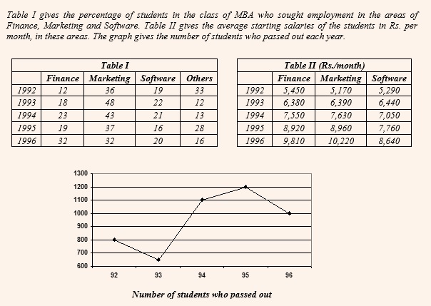
Combined Data Sets
Data is represented in two or more different types of data sets. It could be combination of a table and a graph or two or more graphs. You may have to correlate the data in different data sets to solve these questions. Thus interpret ting data takes time. These type of sets are very common in GRE. However since CAT is going online, there is a good chance that these sets may figure in CAT as well. However our gut feel is that if such a set comes in CAT, then it would not be heavy on data and be an easy set to interpret because of the limited space on the computer screen.
Cheat Code to crack DI sets containing Combined Data Sets?
1. Try to establish a relationship between different data sets
If you realize, in the above set, you need to first get the number of students who passed out every year from the line graph given below. For Eg. 800 students passed out in 1992. Of these students, what percentage of students opted for what specialization is given in Table 1. Thus, of this 800 students, 12% opted for Finance which accounts for 96 students. And finally, the average starting salaries of these specializataions is given in Table 2. Thus, in 1992, the average starting salaries of 96 students who opted for finance was Rs.5450 per month. It is important to also note that the average starting salaries of students who opted for ‘Other’ specialization cannot be established.
Researched and Compiled by Manish Salian
Manish Salian, the Academic Head at CPLC, has taken the CAT 15 times and has taught more than 20000 students in 20 years!