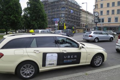
It easier said than done but upfront, this looks much like a disaster than a design overhaul.
Often it's said, the road to hell is paved with good intentions. And we don’t want to doubt what Uber was up to, just the outcome seems a bit awry and what better but to learn from others ahead of us.

But understandably, it is one of the better honest efforts in recent times in making a significant change in brand design. Let's look at that in detail, first.

Setting a vision for your branding is very critical.
Vision acts as a guiding path to what your Organization is trying to achieve through the exercise.
Have you ever looked at someone’s hairstyle and thought “oh my, you peaked in the 1990s?” Well that’s a bit how I feel about Uber’s look today. It’s not just that we were young and in a hurry when we replaced our red magnet logo with today’s black badge four years ago. It’s that we were a fundamentally different company. — Travis, CEO Uber.
Rebranding is all about continuity & evolution.
Change doesn’t have a context but evolution is darwinian. It keeps the core of the brand and changes the others.
We’ve also introduced the concept of the bit throughout our design framework. This will put our technology front and center, as well as provide consistency, highlight information and make our brand easy to recognize. — Travis.
Last but not the least, its about expression and execution.
When we say expression, we mean to say who the brand says it is. Is he the local person? Is he the hero? Is he the everyday mundane that we often miss but cant live without?
The old Uber was black and white, somewhat distant and cold. This belied what Uber actually is — a transportation network, woven into the fabric of cities and how they move. To bring out this human side — the atoms — we’ve added color and patterns. — Travis
Being a big company that somewhere in the hands of every other person, that is often responsible for your experience of the city, I think this is one of the best move to go local. You are in effect enhancing the experience of the city. And when you see the video, you’ll get the gist of the argument.
But then why is there a disconnect?
Is it just resistant to the change? I have been doing back and forth on this but there are some interesting perspectives to look at.
- Having a clear design vision or good start point for your design process is great, but how does Uber’s product and marketing strategies convert into its visual renaissance? How do those tie in with the brand strategy?
- Bits and atom is a relatable concept to Travis, but is the social media outcry on the design really about change of design or because its simply unrelate-able & unemotional?
- While making your brand reflect local markets is a great move, do patterns do justice to the deep and rich cultural differences of their markets? (Skype as a startup did some good work in this area)
- For Uber’s customers and drivers, re-branding came as a surprise. Everyone just woke up to Uber logo missing. Isn’t the change of the brand make-over, also a part of customers’ brand experience?
- Often as startups, founders do end up learning multiple skillsets but can that be taken for expertise and leadership in that area?
Kalanick is not a designer. He’s an engineer by training and an entrepreneur by nature. Yet he refused to entrust the rebranding to anyone else. This was an unusual decision. Most CEOs hire experts — branding agencies that specialize in translating corporate values into fonts and colors — or tap an in-house team. Not Kalanick. — Wired, Inside Story of Uber’s Radical Rebranding
Its sounds almost as if he hijacked the whole design process. For most people, asking what the logo form is and the simplest answer is, t
he circle is an atom, square is a pixel. That's a thought to come out with over 2 years of rebranding work, then you really needed a designer agency onboard.
https://vimeo.com/153889029
After really going through many articles and opinions around, you can see how much Uber matters to people and how much they felt ‘cheated’ to wake up to a new design. After a point of looking at these introduction videos by Uber on celebrating cities, you do get to feel maybe it would turn out right. Who knows? Would we even care 2 weeks from now?
Right now, my worry is when the app updates on my parents’ phones. It would mean a series of frantic calls and re-training them with the updates. That's a part of my experience.
------
About the author: Francis has worked in various startup at various stages of inception and also has been involved in the innovation groups through service design and design thinking over the last 5 year. He currently runs a small information design studio based out of Bangalore. He is also a visiting faculty at NIFT.
You can connect with him on LinkedIn
here.


