The study of signs and symbols with their interpretation is how Semiotics is defined. In the business world, the first thing that pops in someone's mind is a company logo. The logo of a company is a symbolic representation of the vision, mission and brand positioning. It is a visual connection that a company has with its customers.
In this article, I did a semiotic analysis of the Google logo by dissecting the brand values and positioning of the brand and the representation of these in the logo.
Google Logo Evolution
The word ‘Google’ has become a verb now. Google is equivalent to the word ‘search’. The brand is international, user-friendly and extensive. It stands for making things easier for the user. Searching on Google is the simplest thing and this people-centric and ease-of-use approach is what the brand is known for. Therefore, the logo of such a brand needed to be simplistic as well.
The evolution of the logo was as follows –
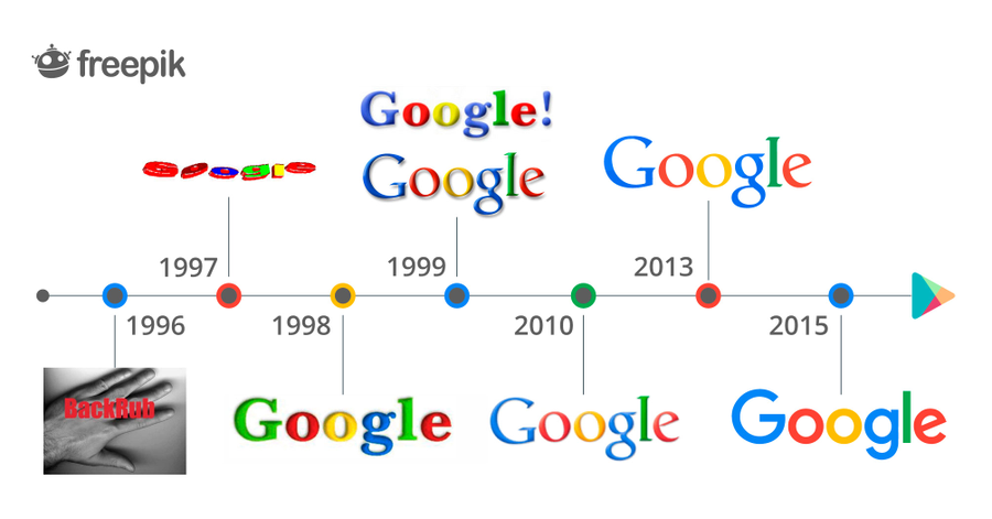
The Brand and its Repositioning
The mission statement of Google is “Our mission is to organize the world’s information and make it universally accessible and useful.” with the use of Google’s colours to emphasis on the key points. The vision statement is “to provide access to the world’s information in one click.” The vision emphasis on the ease-of-use and simplicity in the technology. The representation of all these elements of the vision and mission statement can be seen in the logo.
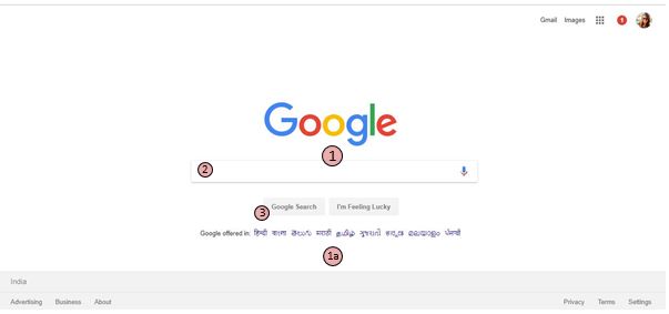
When one enters the website, the visual emphasis is on the centre of the website. The eye moves from 1 – 2 – 3 and completes the visit of the page. In cases of changing the language the additional movement is added 1-1a-2-3. Unlike the other search engines, Google doesn’t clutter its homepage with news, ads or any other information except what it is known for – being a search engine. The page uses minimal text and minimal colours with minimal data. This is the minimalistic design that attracts millions of users and has worked in Google’s favour for years.
The Current Logo

At the axiological level, it can be represented with words such as it being an information provider, knowledgebase, simplicity, user-friendly searches, mass service, keyword finder, navigation tool, covers everything under the sun, organised, digital encyclopaedia etc.
At the semi-narrative level, I find the ‘Google Assistant’ as someone who is extremely knowledgeable, easy to talk to, always ready to help and a great companion for finding answers to all the queries.
Google recently underwent a rebranding, the changes from the previous one seemed insignificant but these little tweaks made a huge difference. The analysis will be done by using Saussure’s two-part model of the sign – Signifier and Signified as well as Peirce’s triadic framework of signification (representamen-object-interpretant).
Google Visual Analysis: Here, the signifier is the bold colourful text written on a white background which signifies that the text needs to stand out and simplicity was the main theme that the designer wanted to focus on. The angular ‘e’ in the end is inclined to show a movement upwards which signifies linear growth and improvement as well as breaking the rules.
Google Colours: The signifiers are the bold and distinct colour choice. All the colours chosen are primary colours, except green which signifies that Google loves being an outlaw and loves innovation. These primary colours have been a part of the logo since a very long time. There were slight changes in the colour. Except the shade of blue, the rest three were toned down a shade. This signified the lightness to the eyes and minimalism in approach.
Google Text: The signifier is the geometric sans-serif typeface called Product Sans which is a Google customised font type. This signifies simple, geometrical and approachable style. The text is extremely comprehensible and has evolved with time, as the world is moving towards minimal and simplistic design so is the Google font type – with no serifs or intricate edges to the letters.
Google 'G'
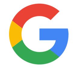
Google came up with a new favicon (short for favourite icon) which was a shift from the previously used ones as this favicon integrates the whole logo in one letter - G. The text font style and the colours of the logo are maintained in this favicon.
In my opinion, this is not just a favicon but Google’s way of making the logotype into a graphic which can be recognised as representing a visual identify for Google (like the tick is associated with Nike).
The Imperfections in the Google 'G'
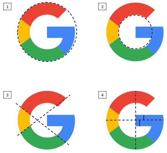
The imperfections as identified in the images are as follows -
1) The outer shape is not a perfect circle.
2) The inner shape is also not a perfect circle.
3) The backward slash line is coinciding on both ends, but this is not the case with the forward-slash line. There is a little extra addition towards the end of the red region.
4) The horizontal line is cutting the G in the centre, but the width of the blue surface above and below the dotted line is not equal but wider below the line.
After identifying these imperfections in the logo, I recreated the Google G logo with all the rectifications that could be done. The resulting logo is completely symmetrical with respect to the following – both inner and outer shapes are perfect circles, the division of the colours in the logo is completely identical, the end tip of the G is also inclined perfectly and the width of the tail of G is also symmetrical from the centre.
Perfecting the Imperfections
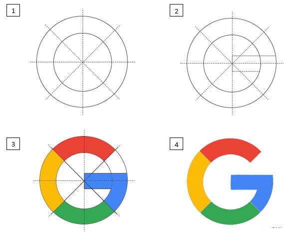
The first two images show the segregation lines I drew to get a perfectly symmetrical shape. In the third image, I filled the colours according to the existing logo but here all of them occupy the same width. The fourth is the final ‘perfected’ logo of Google.
The logo doesn’t visually appeal to the eye because the ‘imperfect’ logo was designed such that there is more visual weight added to the logo. Along with this, the colours were filled in a manner that the movement of eye flows through the logo in a smooth manner.
These elements make the user love the ‘imperfect’ yet aesthetically appealing logo for Google G. Themes that a logo has are (1) Direction toward the Future, (2) Identity with Viewers, (3) Instant Recognition and Distinctiveness, (4) Consistency throughout Evolution, (5) Invocation of Change, and (6) True Representation of Corporate Identity. The Google logo seems to check all the boxes with the graphical logotype and the Goggle G.